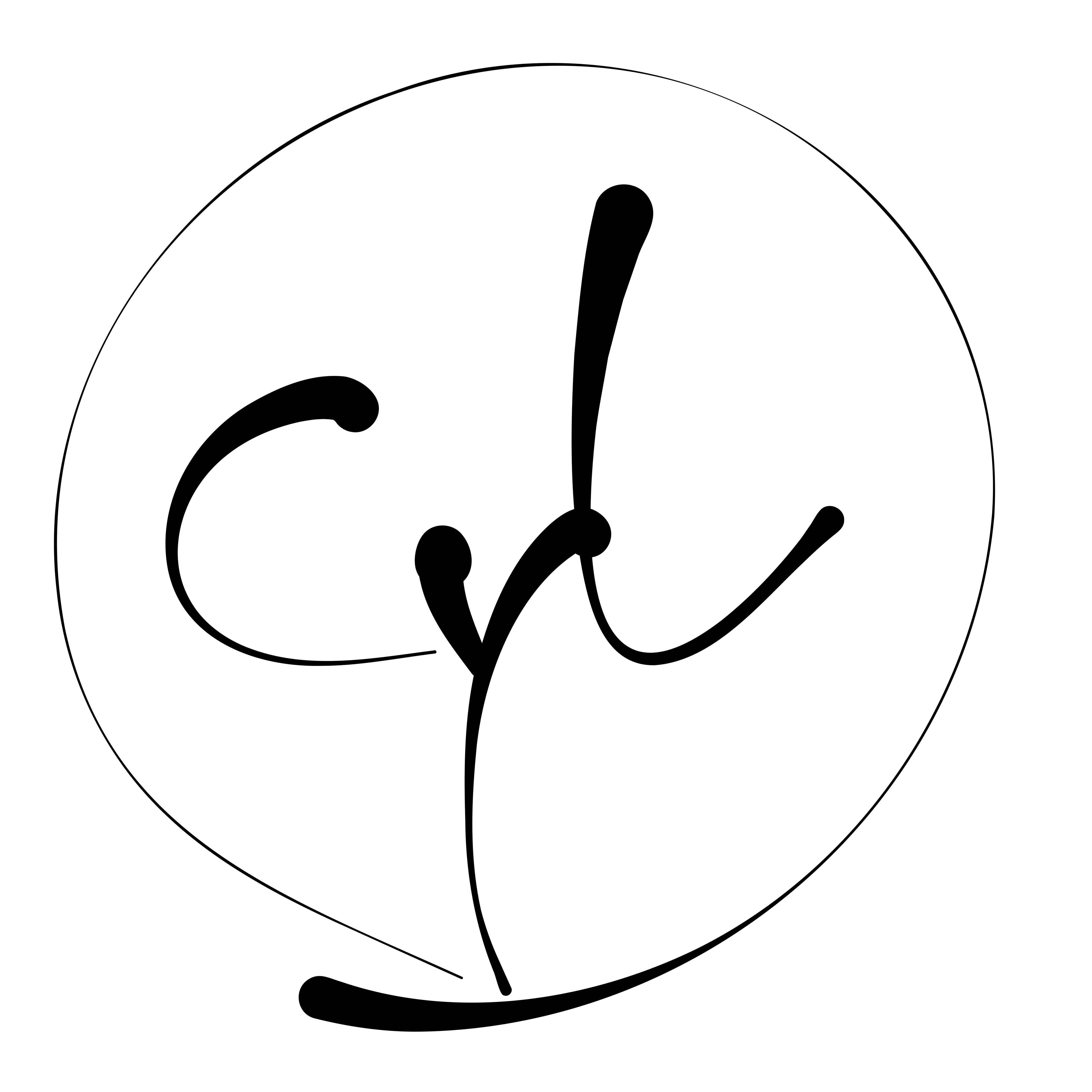
한글 '차'를 모티브로 한 치과 로고 - 미니멀리즘과 전문성의 만남
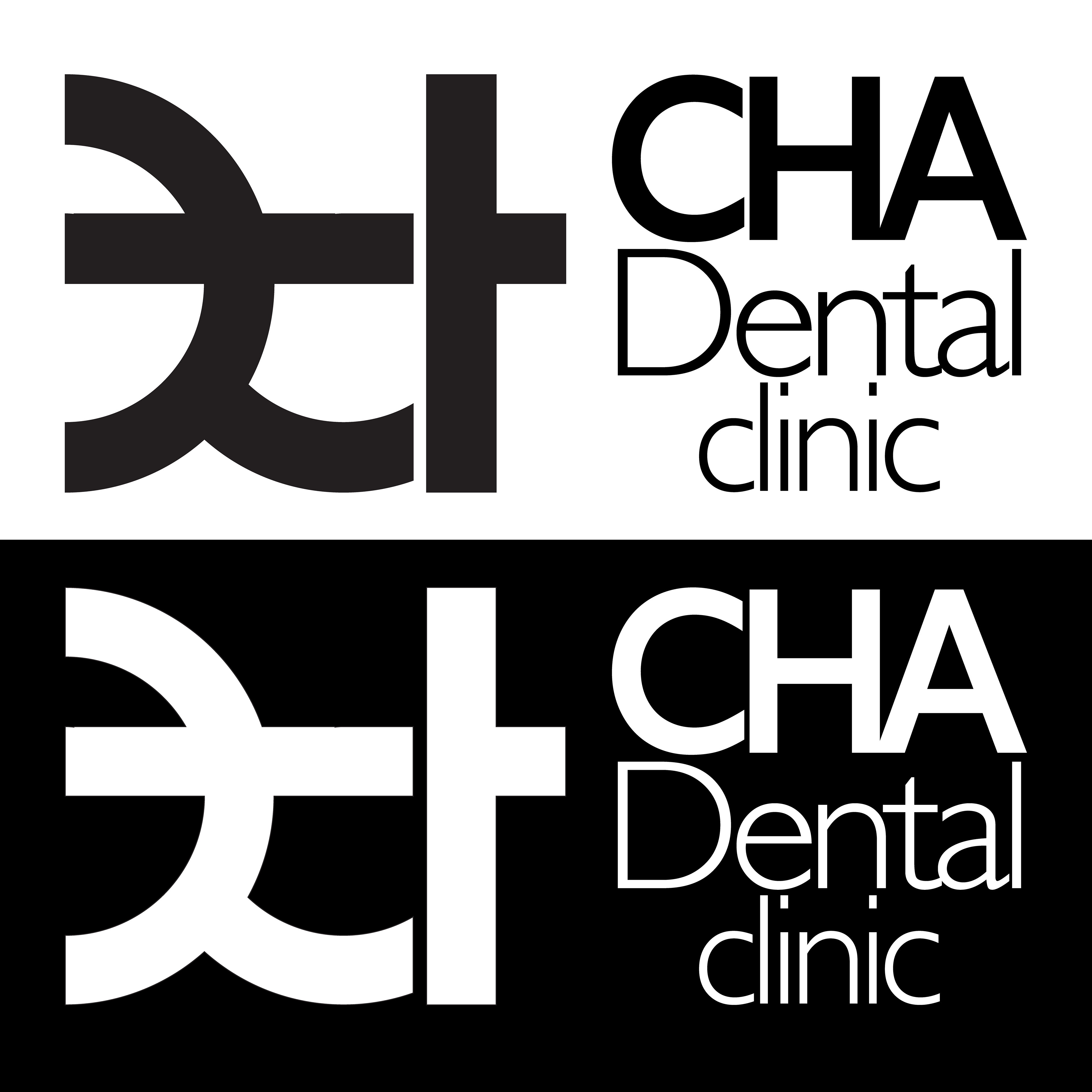
"차 덴탈 클리닉"의 새로운 아이덴티티를 제시하는 로고 디자인입니다. **한글 '차(ㅊ, ㅏ)'**의 조형적인 아름다움을 모던하고 심플한 하나의 마크로 재해석했습니다. 복잡한 장식 없이 오직 형태만으로 클리닉의 전문성과 신뢰감을 표현하고자 했습니다.
이 로고 마크는 간판, 명함, 유니폼 등 어디에 적용되어도 시각적인 집중도를 높이며, 세련되고 기억하기 쉬운 브랜드 이미지를 구축합니다. 미니멀리즘을 통해 환자 중심의 깨끗하고 정직한 진료 철학을 시각적으로 전달합니다.
Minimalism Meets Expertise: Cha Dental Clinic's Korean-Inspired Logo
This logo design presents the new identity for "Cha Dental Clinic." We have reinterpreted the structural beauty of the Korean character 'Cha (ㅊ, ㅏ)' into a single, modern, and simple mark. By eliminating unnecessary complexity, the design purely expresses the clinic's professionalism and trustworthiness.
This clean, distinctive logo mark ensures high visibility on signage, business cards, and uniforms, building a sophisticated and memorable brand image. Through minimalism, it visually communicates a philosophy of patient-centered, clean, and honest care.